You are using an out of date browser. It may not display this or other websites correctly.
You should upgrade or use an alternative browser.
You should upgrade or use an alternative browser.
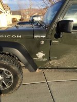
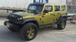
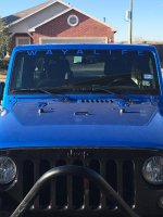
Show off your WAYALIFE Decals!
- Thread starter CarsonCindy
- Start date
RageKage
Member
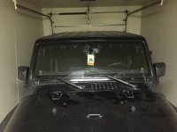
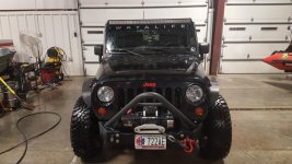
I have seen quite a few posts on here about how the black does not stand out because of the windshield trim, so I decided on a different approach. I put t under the trim! I think it came out amazing. And yes I'm going for the all black murdered out look. Lol but I think if you have a black banner the best spot for it is under the windshield trim. Doesn't seem to get drowned out.
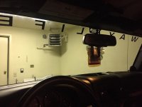
From the inside you can see that it really doesn't inhibit any, or much of the field of vision.
Maybe this should be the placement for black banners?
Last edited:
WJCO
Meme King
View attachment 186939
I have seen quite a few posts on here about how the black does not stand out because of the windshield trim, so I decided on a different approach. I put t under the trim! I think it came out amazing. And yes I'm going for the all black murdered out look. Lol but I think if you have a black banner the best spot for it is under the windshield trim. Doesn't seem to get drowned out.
View attachment 186940
From the inside you can see that it really doesn't inhibit any, or much of the field of vision.
Maybe this should be the placement for black banners?
That turned out really good. You can see that pretty well.
RageKage
Member
That turned out really good. You can see that pretty well.
Thanks! Not a bad job for a few drinks in and trying to balance my weight on the hood hinges so I didn't dent the hood...
swampdog
New member
View attachment 186939
I have seen quite a few posts on here about how the black does not stand out because of the windshield trim, so I decided on a different approach. I put t under the trim! I think it came out amazing. And yes I'm going for the all black murdered out look. Lol but I think if you have a black banner the best spot for it is under the windshield trim. Doesn't seem to get drowned out.
View attachment 186940
From the inside you can see that it really doesn't inhibit any, or much of the field of vision.
Maybe this should be the placement for black banners?
How in the hell do you get out of that thing in the garage? Looks tight.
RageKage
Member
How in the hell do you get out of that thing in the garage? Looks tight.
The only real tight spot is coming through the door, I think I have a foot or less of clearance on both sides and then opens up inside to about 3 1/2 feet or so to the wall on both sides. It's extremely tight but I'm just glad I finally have a garage it can fit in! Damn Alaskan military housing.... So inconsiderate to Jeepers
notnalc68
That dude from Mississippi
Nice!! Very cool
dwvninety
New member
Now that's nice.
BitBucket
Member
Epic right there!
Sessoms14X
Member
View attachment 186939
I have seen quite a few posts on here about how the black does not stand out because of the windshield trim, so I decided on a different approach. I put t under the trim! I think it came out amazing. And yes I'm going for the all black murdered out look. Lol but I think if you have a black banner the best spot for it is under the windshield trim. Doesn't seem to get drowned out.
View attachment 186940
From the inside you can see that it really doesn't inhibit any, or much of the field of vision.
Maybe this should be the placement for black banners?
This is where I put mine as well. It definitely helps it stand out but can still be a little difficult to see in pictures and such...
Rasta Jeep
New member
My Wayalife
I always loved that Wayalife brand and having a Jamaican background Wayalife is an actual phrase spoken in the the patois dialect commonly referred to the Rastafarian Wayalife that is about peace & love, natural living and eating, nature and the earth! Big ups! and Protection from the Rasta Jeep!!!
I always loved that Wayalife brand and having a Jamaican background Wayalife is an actual phrase spoken in the the patois dialect commonly referred to the Rastafarian Wayalife that is about peace & love, natural living and eating, nature and the earth! Big ups! and Protection from the Rasta Jeep!!!
Attachments
WarriorJeep
New member
WJCO
Meme King
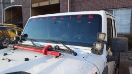
Nice pillar lights. I almost went with those ones. You like em?
WarriorJeep
New member
Yes very much, I often split the top ones off at a more severe angle to make the field of view wider
WJCO
Meme King
View attachment 188193
Matches perfect!!
Sweet. Looks great.
CarolinaDozer
New member
NastyNate
Member
Sweet. Looks great.
Thank you!

