How about iOS 7?

I don't like the new look either. I wish I hadn't updated.

I'm with you man. I politely refer to the new update as Unicorn Vomit. Magical, yet disgusting. Sure there are some nice new features (easy access to air plane mode & flash light), but I absolutely hate the look. I had to drop my brightness almost 90% just to be able to look at the screen, the constantly zooming folders aren't doing anyone any favors, & (unless I still can't find it) they took away the best calendar view so I've gone to a third party calendar app.

Sorry to be the bearer of bad news, but I had a WAL app issue this morning. Tried a quote post using the app on an iPhone 5 running iOS 7.0 this morning and it quoted a different reply. I'll try to see if I can replicate the issue and confirm that it wasn't a PEBKAC error.

I'm sure it'll grow on me over time, but for now I wish I hadn't updated.


I think I will just leave mine alone and keep the old OS ;)

You chose wisely.
 
Last edited:
As someone who has been using iOS7 for the past 3 months now, my opinion may be a little different than those who just experienced it for the first time yesterday.

First, the minimalism is deliberate. What at first may look like they've wrecked something may in time be something that you not only get used to, but that you find has made it take less swipes and less time to get to what you need. The whole theme of iOS7 to get the OS out of your way and to let the apps take full focus. Of course, since many apps are not yet updated to be prepared for iOS7, you will see that some apps "fit" on the new OS and other apps just look like crap. Microsoft did this first with the Windows Phone and Palm did it with PalmOS/webOS before that. It's a dramatic change but overall I think people will be more productive on the new design (even if they don't like how it looks).

My most used feature is command center. Swiping up and being able to toggle bluetooth, wifi, flashlight, control audio playback, share, and air drop all from one little tool is extremely useful.

iTunes Radio kicks ass and I use it so much that I've exceeded my monthly data quota twice so far since getting the first beta of iOS7.

Notification Center no longer contains the current temperature, which is annoying as hell when I'm trying to figure out what to put on to go for a run (because stepping out onto the porch to feel the current temperature is far too much of a burden!).

Finally, give it a bit of time. The capabilities that developers have in iOS7 are SO much better than they used to be that the things apps are going to be able to do easily and cheaply are staggering. I would expect a lot of great new features to show up in some of your favorite apps and a LOT more indie games to start cropping up in the next few months.

p.s. "Unicorn Vomit".. That is AWESOME. I am totally stealing that phrase.
 
I'm not even sure I did the last update? :thinking:

Judging by the picture above it looks like Jony Ive's kid drew the app icons with a F'n crayon!

Sigh...I used to be an early adopter of Apple stuff, but they haven't "wowed" me in quite some time.

Sent from my iPhone 4!
 
I'm not even sure I did the last update? :thinking:

Judging by the picture above it looks like Jony Ive's kid drew the app icons with a F'n crayon!

Sigh...I used to be an early adopter of Apple stuff, but they haven't "wowed" me in quite some time.

Sent from my iPhone 4!

They havn't done anything too impressive since the sad passing of Steve Jobs.
 
As someone who has been using iOS7 for the past 3 months now, my opinion may be a little different than those who just experienced it for the first time yesterday.

First, the minimalism is deliberate. What at first may look like they've wrecked something may in time be something that you not only get used to, but that you find has made it take less swipes and less time to get to what you need. The whole theme of iOS7 to get the OS out of your way and to let the apps take full focus. Of course, since many apps are not yet updated to be prepared for iOS7, you will see that some apps "fit" on the new OS and other apps just look like crap. Microsoft did this first with the Windows Phone and Palm did it with PalmOS/webOS before that. It's a dramatic change but overall I think people will be more productive on the new design (even if they don't like how it looks).

My most used feature is command center. Swiping up and being able to toggle bluetooth, wifi, flashlight, control audio playback, share, and air drop all from one little tool is extremely useful.

iTunes Radio kicks ass and I use it so much that I've exceeded my monthly data quota twice so far since getting the first beta of iOS7.

Notification Center no longer contains the current temperature, which is annoying as hell when I'm trying to figure out what to put on to go for a run (because stepping out onto the porch to feel the current temperature is far too much of a burden!).

Finally, give it a bit of time. The capabilities that developers have in iOS7 are SO much better than they used to be that the things apps are going to be able to do easily and cheaply are staggering. I would expect a lot of great new features to show up in some of your favorite apps and a LOT more indie games to start cropping up in the next few months.

p.s. "Unicorn Vomit".. That is AWESOME. I am totally stealing that phrase.

I'll agree that the upswipe for those controls is handy & I'm happy I can FINALLY shove my stupid stupid stupid NewsStand App (Does anyone use that thing?) in a folder. What I'd really love is the ability to uninstall a bunch of core apps that I never ever use (Think RAG3HACK app hider but more permanent) that take up a dedicated 'crap' folder.

For flipping through the month at a glance, this new calendar set up is pretty terrible. I get that you have things going on when you see a dot, but what are the things? Do I need to jump from screen to screen for each day to see what's going on in a month view? Going with a third party app here to solve unless there's something obvious that I'm missing?

I wouldn't mind giving iTunes Radio a shot, but it has yet to show up on my phone. Other forums say a couple reboots will do the trick, so I'm sure it'll show up sooner or later.

When it comes to the rest of the apps, I don't have any gripes on my current apps. They still do their thing just fine imho. In fact I find myself spending more time in the apps thus far to keep from looking at the Unicorn Vomit (patent pending! :bleh:) theme they've forced on us all. I'm a minimalist & I <3 minimalism but this OS doesn't strike me as minimalistic, it seems much more busy and in your face than iOS 6. Then again, this is all opinion on the design. I'm not an app developer, so I don't get to appreciate the code behind the machine.
 
Last edited:
IMO iOS 7 is a huge improvement. It's only been the first day and we all know how this works. Periodically until the next iOS release they will make changes and updates to the OS according to the feedback they receive. I do agree that the update is a bit colorful and plain at the same time but is something that can be overlooked due to the plethora of new features.
 
Switched both personal and work phones last night. Apple did it again. Great OS upgrade. Even on my iPhone 4 it works great.
 
What do you guys think about it? I just updated but I'm very impressed visually so far. Any new tricks to share??

I'm going to be staying up late tonight to order the 5S. 12:00 a.m eastern time to be exact! As of my iPhone 5 kinda went for a swim. Sucks to use an iPhone 3G for a backup phone for the past 4 weeks 😕
 
Last edited:
...

For flipping through the month at a glance, this new calendar set up is pretty terrible. I get that you have things going on when you see a dot, but what are the things? Do I need to jump from screen to screen for each day to see what's going on in a month view? Going with a third party app here to solve unless there's something obvious that I'm missing?

....

I sent you a pm as well. You can still view your calendar by month. Open the calendar. In the day view the month "September" will be in red in the upper left hand portion of your screen. Click on the word "September" and it will take you to the month view of your calendar.
 
I sent you a pm as well. You can still view your calendar by month. Open the calendar. In the day view the month "September" will be in red in the upper left hand portion of your screen. Click on the word "September" and it will take you to the month view of your calendar.

Thanks for the PM. I had previously seen the month with dots view but that doesn't add any value. Ok, I'm busy on these days, but what am I busy doing? To see what the events are, I need to click the day. That takes me to the day view, and then back to month view to look at the rest of the month... and lather, rinse, repeat. In iOS6, you had the month view on top with dots, but below it also displayed the actual events for the day selected. It's that second part that's missing from the iOS7 calendar that's the deal breaker for the calendar for me.
 
Thanks for the PM. I had previously seen the month with dots view but that doesn't add any value. Ok, I'm busy on these days, but what am I busy doing? To see what the events are, I need to click the day. That takes me to the day view, and then back to month view to look at the rest of the month... and lather, rinse, repeat. In iOS6, you had the month view on top with dots, but below it also displayed the actual events for the day selected. It's that second part that's missing from the iOS7 calendar that's the deal breaker for the calendar for me.

Gotcha. Not sure if this helps you but clicking on the magnifying glass "search" icon brings up a scrolling daily calendar that does not end. At least it will save you the lather, rinse, repeat. :cheesy:
 
Gotcha. Not sure if this helps you but clicking on the magnifying glass "search" icon brings up a scrolling daily calendar that does not end. At least it will save you the lather, rinse, repeat. :cheesy:

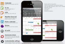
Check out the Awesome Calendar app in iTunes. The monthly view offers a bit more detail vs. the iOS7 calendar monthly view. You can try the lite version for free to see if it works for you using the Awesome Calendar Lite version. Only one day into it, I'm liking it. Do I like it $7 worth? The jury is still out on that one, but so far it's looking good.

Awesome-Calendar-2.2.jpg
 
I'm not even sure I did the last update? :thinking:

Judging by the picture above it looks like Jony Ive's kid drew the app icons with a F'n crayon!

Sigh...I used to be an early adopter of Apple stuff, but they haven't "wowed" me in quite some time.

Sent from my iPhone 4!

X2! I don't want that shit. I was going to buy the iPhone 5s but not if its going to have iOS7 already installed.
 
I'm with you man. I politely refer to the new update as Unicorn Vomit. Magical, yet disgusting. Sure there are some nice new features (easy access to air plane mode & flash light), but I absolutely hate the look.

X 2 on stealing the phrase "Unicorn Vomit" best way to describe the new iOS.
 
I'm not really sure if I like it or not. The colors I'm going to have let them grow on me. The way stuff fades in and out is kind of cool. I do like the ability to block an individual number.

As with anything. It will take some getting used to.
 
While I haven't got the chance to use the update (or even update), i'm not sure I'm going to like it as much as everyone else seems to :cheesy:. At any rate, they updated the icloud page as well to match the crappy new design. Makes checking my email 10x harder.

I really want an iphone 5s when I get back to the U.S. But not at the expense of a shitty design. :naw:
 
All other features aside, the best feature is that you can block individual contacts. If you look up a contact and then go to the bottom of the record, it will offer you the option to block. no voicemail, no ringing phone, and no texts from those numbers.

I had a few telemarketers that had my number and this has totally done away with them.
 
Top Bottom